Minor UI bug: cert properties table header colors are difficult to read
-
When reissuing a certificate, there is a table showing the differences between several certificate attributes and how they would be limited if strict security is selected. This table has a light pink header with white text, making it virtually unreadable.


-
@xpxp2002 said in Minor UI bug: cert properties table header colors are difficult to read:
When reissuing a certificate, there is a table showing the differences between several certificate attributes and how they would be limited if strict security is selected. This table has a light pink header with white text, making it virtually unreadable.


Use the default colour scheme:-

-
@nogbadthebad Yeah, so it's an issue with that particular theme.
I can faintly see the table headers by selected them, but I was trying to raise attention to the issue so that it could be included for a fix in a future release.
-
@xpxp2002 I think the themes at one time were user contributed.
https://redmine.pfsense.org/ << issues should be reported here
-
This post is deleted! -
Common knowledge applies for pfSense !
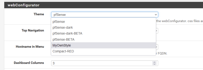
So, go to /usr/local/www/css/ and copy the standard style sheet 'pfSense.css' to your own :
[22.05-RELEASE][root@pfSense.did-I-mess-up-again.net]/usr/local/www/css: cp pfSense.css MyOwnStyle.cssAnd now you'll see :

Open MyOwnStyle.css and another one, like pfSense-dark-BETA.css as an example, and now you can control whatever you want.
If something goes horribly wrong : undo your edits.
Still wrong ? Select the "pfSense" theme in the GUI and problem solved.

