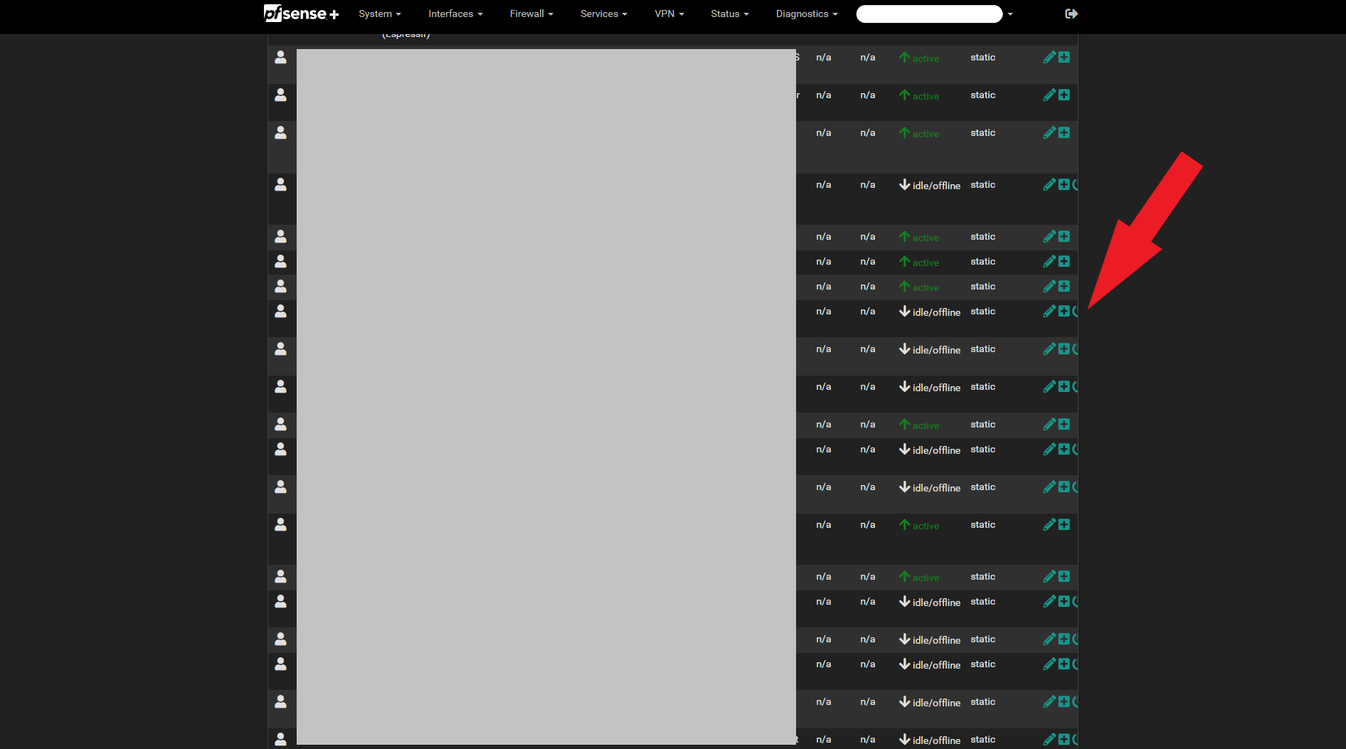
WebGUI of [Status>DHCP Leases] cut off
-
Hello,
after the update to 23.01 the WebGUI under Status>DHCP Leases is cut off, at the bottom i can scroll to the right to see all of the rows.
There is so much space on my screen that is blank, is this a problem on my side or is it a pfsense GUI problem?

-
It's probably the theme you're using or a browser setting. It doesn't happen here with the default theme.
Seems familiar, though, there may already be another thread about this somewhere.
-
@jimp said in WebGUI of [Status>DHCP Leases] cut off:
It's probably the theme you're using or a browser setting. It doesn't happen here with the default theme.
Seems familiar, though, there may already be another thread about this somewhere.
Correct,
it only happens with pfsense-dark theme
-
@horstzimmermann said in WebGUI of [Status>DHCP Leases] cut off:
it only happens with pfsense-dark theme

and now you will tel us you use the pfsense-dark-BETA theme which is not pfsense-dark ? ;)
Btw : for good manners : use another browser.
Or wipe the browser cache. -
I already tried that....
-
Hummm.
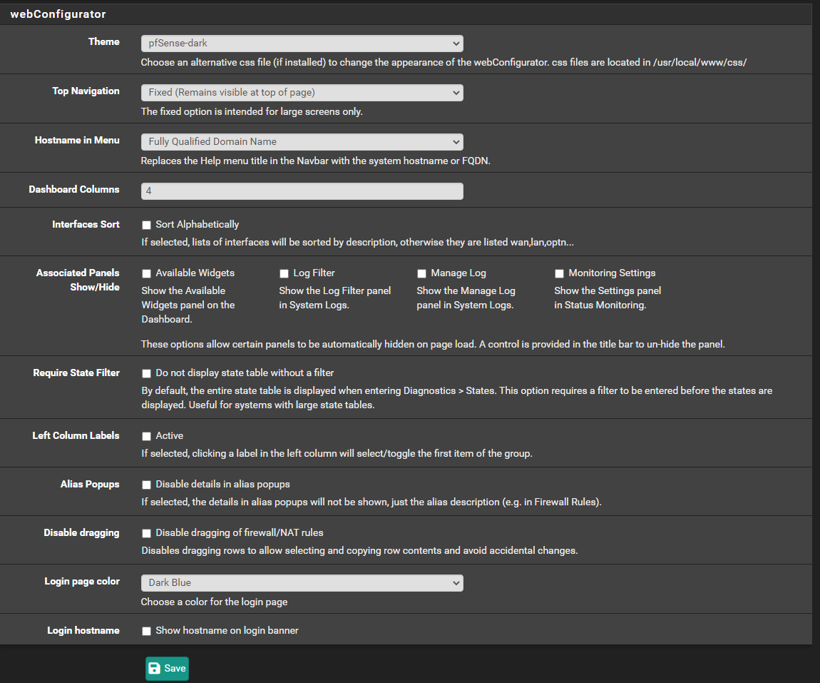
What do you have under System > General Setup > Web configurator ?
If these settings are the same (as mine) and your files (style sheet etc) are the same, the same output should be generated.
The browser and settings have also a word to say of course.Just trying to duplicate what you see.
-
-
I'm using your settings now, notably the "4" colum mode.
The issue is hidden somewhere under the box grey :

mine :

check the allignmenet with the menu word Diagnostics and the two n/a n/a below it.
Yours is shifted to the right.
So one of the earlier columns is wider as what should be ( ? ).
My IPs are 192.168.1.x where x goes from 2 to 200+.
MACs are all .. well .. MACs.Do you have long huge ClientID, hostname or description field ?
edit :
Ok, got it.
solution : add dashes (description : and spaces) the the long text you've entered so the system (and for humans) can known here to soft line break extra long lines.
-
here is an example of one of my clients,
if the description is to long it gets a new row, seems pretty normal to me...

-
Possible you try with the "192.168.1.x" instead of the 192.168.178.x" (I know, silly)
The MAC, and the rest, looks fine.What is this :

edit :
Go here : /usr/local/www/css/
You find a list with files, you'll understand what they mean.
Copy the one you use to a new new.
Back in the GUI, you will find this new new now added to the theme list.
Select it.Edit the file - a style sheet actually - you've just copied. You are actually making you own theme. Will you make a Banana-pfSense ?
The file contains what is know as html stuff, worlds most used language.
Think about using a lot of Ctrl-F5 in your browser to force it to re read the style sheets. -
-
Ah, ok, something is added to MAC field. Like : The MAC ID is known, so it adds the name of vendor.
Can you make that go away ? -
@gertjan said in WebGUI of [Status>DHCP Leases] cut off:
Ah, ok, something is added to MAC field. Like : The MAC ID is known, so it adds the name of vendor.
Can you make that go away ?no, i did not set this to be shown neither did i find a setting to turn it off...
thank you for the help, i think there is something wrong with my
pfSense-dark.csscan you send me yours to test? please
if i use this all looks fine
Re: Widescreen Theme (Tested on 2.4.4 & 2.5.2)

-
@horstzimmermann said in WebGUI of [Status>DHCP Leases] cut off:
can you send me yours to test? please
Compared mine with 'the source' : Here it is : https://raw.githubusercontent.com/pfsense/pfsense/master/src/usr/local/www/css/pfSense-dark.css
@horstzimmermann said in WebGUI of [Status>DHCP Leases] cut off:
if i use this
Use what ? edit : ah, ok, another forum thread.
-
