Forum change?
-
The Forum landing page looks different for me as well. The fonts of the sub-forum names are much smaller and no longer bold nor blue.
-
@bmeeks I wouldn't mind the smaller on the main page - I am rarely on it.. But the recent page I am on all the time.. If it doesn't get corrected soon will have to alter the css myself locally I guess.. It's horrible imho.. And lack of distinction between deleted or just read is not discernible.
Maybe there is a setting to no show deleted topics or posts in mod settings or something? So could make that issue go away, don't really care to see deleted items or topics anyway.. But before it was easy to see that they were deleted.. Currently just looks like I have read that topic.
An intelligent man is sometimes forced to be drunk to spend time with his fools
If you get confused: Listen to the Music Play
Please don't Chat/PM me for help, unless mod related
SG-4860 25.07.1 | Lab VMs 2.8.1, 25.07.1 -
In the mobile view, the chats and notifications are just empty if you open them through the quick access in the top right corner — there's nothing there. On the PC, the history is still available.
-
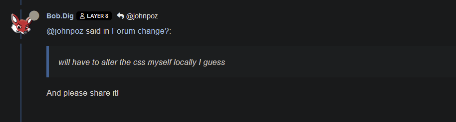
@johnpoz said in Forum change?:
will have to alter the css myself locally I guess
And please share it!
-
Has it now gotten worse?
Why is the this is a white box? Looks the same in firefox and chrome.. So its not something with my firefox..
-
The forum software was recently updated.
We are looking into this.
-
@johnpoz said in Forum change?:
Did something change in the forum - or maybe the css?
Looks horrible
It was not like this earlier today. Fonts are huge.
Same here, but I assumed it was my end, as I have had a few websites all suddenly looking different, but at least in the case of this forum, I guess its not my end.
-
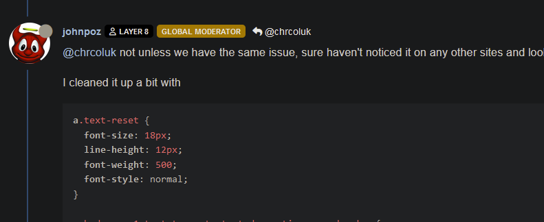
@chrcoluk not unless we have the same issue, sure haven't noticed it on any other sites and looks same in chrome as it does on FF.
I cleaned it up a bit with
a.text-reset {
  font-size: 18px;
  line-height: 12px;
  font-weight: 500;
  font-style: normal;
}

a.badge.px-1.text-truncate.text-decoration-none.border {
  background-color: #000000;
  border-color: #000000;
  border-style: none;
}
Using stylebot in FF.. Got rid of the white boxes and shrank the topic title size a bit
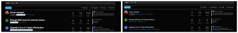
if they don't correct in a few days I will spend some more time on it - but this is better imho.. need to shrink the votes,posts,views down a bit they are quite large as well.
edit: ok this is usable
add this to the above changes
span.fs-4 {
  font-size: 24px;
}

li.category-item.hover-parent.py-2.mb-2.d-flex.flex-column.flex-lg-row.align-items-start {
  padding-bottom: 0px;
  padding-top: 1px;
  margin-bottom: 5px;
}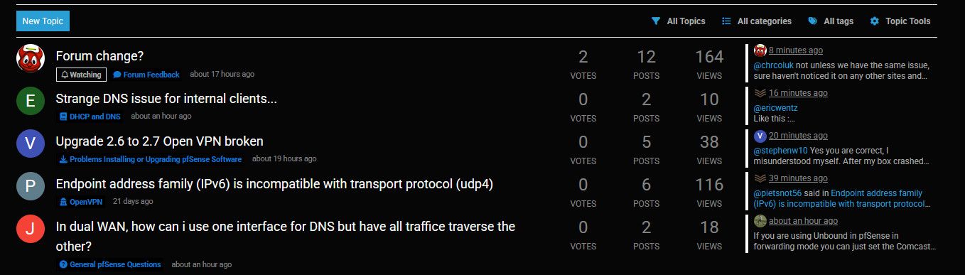
-
Looks like that with every forum update, the UI themes become less and less readable, especially dark themes...
-
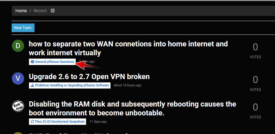
@mvikman yeah something is off with read topics as well - doesn't seem to change, but deleted topics show like what read use to look like.. Before there was like bold for topics with unread, normal for read topics and then faded for deleted ones..
Guess have to dig into CSS again, but it's been so many years ;) There has to be some webpage guys around here that are wizards with css ;)
-
Also on mobile (Safari - iOS) site looks broken

-
Yup I use a dark skin in my view and they are particularly broken. We are looking into what we can do here.
Currently 'Solar' seems most usable of the dark skins to me.
-
@stephenw10 I have mine in a state I can live with using stylebot ;) I can toggle it off or on with a simple click so I will keep checking.. And will also check out the solar theme..
But you know the saying once you go _____ you can never go back ;) hehe so for sure won't be switching to the default hahah
-
Mmm, my eyes can't handle the brightness!
-
curious what the checkboxes are for on messages on https://forum.netgate.com/unread ?
Otherwise, looks fine here in the light…in 2 minutes of looking.
-
@SteveITS you talking about these check boxes?
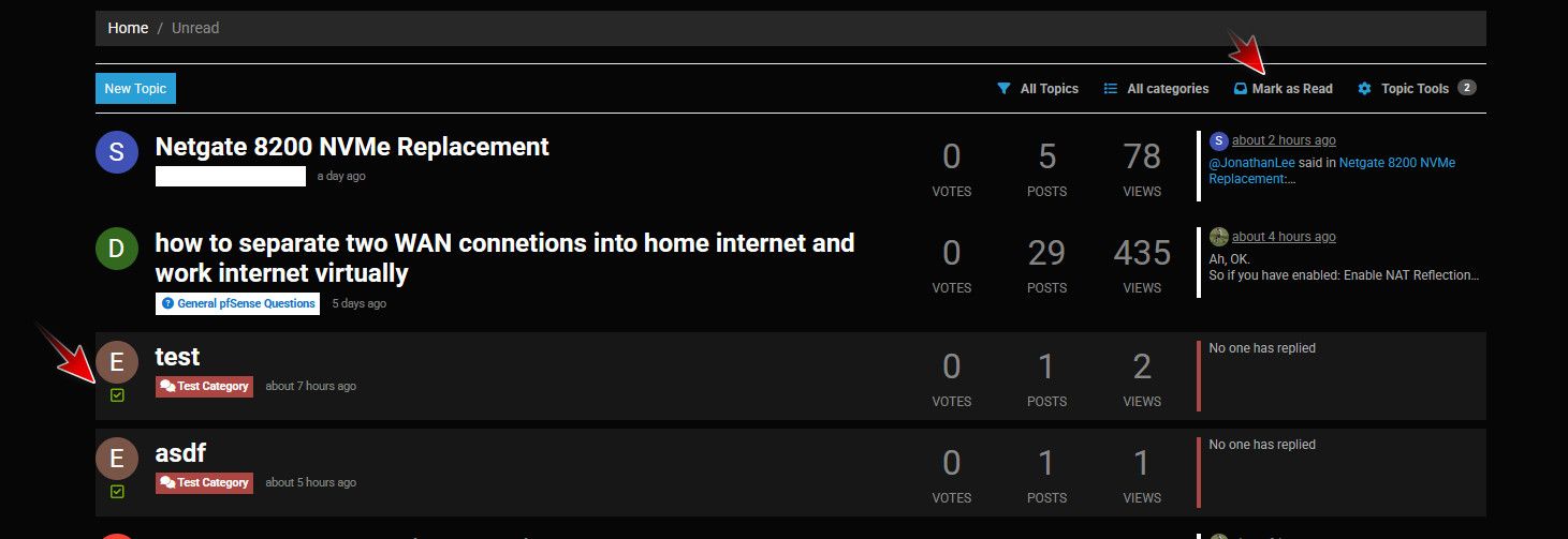
Those are so you can select multiple and mark them as read.
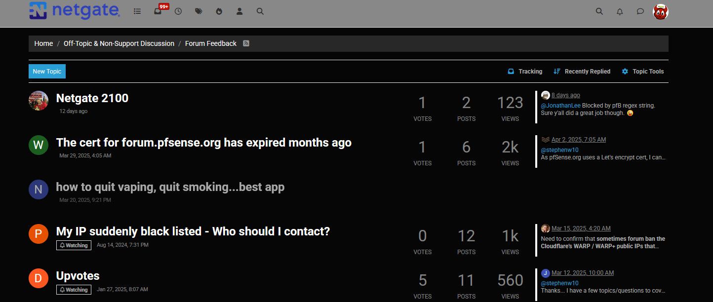
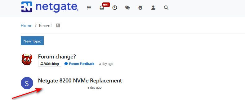
But you think that looks normal? The huge titles, and look at that white blob under the top topic there, the background is the same color as the text - so you can not even see that was posted in official netgate hardware section.
Are you using just the default theme?
The sizes look better with no skin, but look you still can not tell what section this was posted in
-
Only install packages for your version, or risk breaking it. Select your branch in System/Update/Update Settings.
When upgrading, allow 10-15 minutes to reboot, or more depending on packages, CPU, and/or disk speed.
Upvote 👍 helpful posts! -
It’s the Netgate hardware forum that’s not visible but the empty spot is clickable.
-
@SteveITS yeah your font sizes look horrible as well - and see you can not see what category that netgate 8200 was in.. What idiot designer would pick white font on white background?? Someone that is color blind and just randomly picking squares for the color combo? ;) I would think even a color blind person could tell they can't see the text ;)
Unless your blind? And you have your font size huge on your mobile device? ;)
-
FWIW, I use the Dark Reader FF plugin, which does a decent job on most all-too-bright sites. Here's what it looks like when applied to the forum configured with the default forum theme
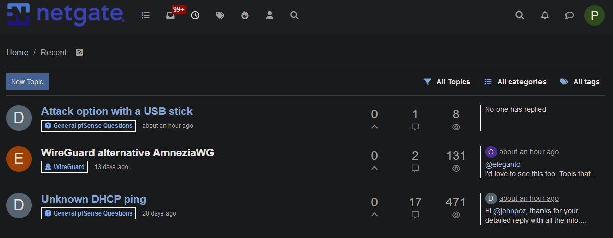
As you can see, it manages to differentiate between read/unread threads, yay!
Threads are also legible: