Forum change?
-
Mmm, my eyes can't handle the brightness!
-
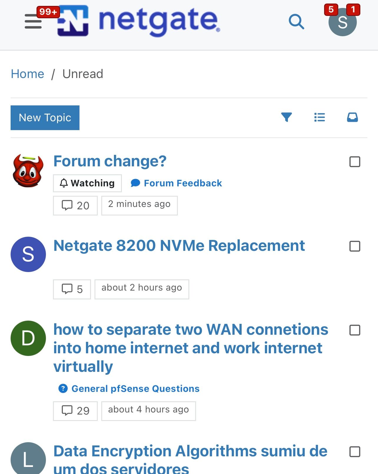
curious what the checkboxes are for on messages on https://forum.netgate.com/unread ?
Otherwise, looks fine here in the light…in 2 minutes of looking.
-
@SteveITS you talking about these check boxes?
Those are so you can select multiple and mark them as read.
But you think that looks normal? The huge titles, and look at that white blob under the top topic there, the background is the same color as the text - so you can not even see that was posted in official netgate hardware section.
Are you using just the default theme?
The sizes look better with no skin, but look you still can not tell what section this was posted in
-
Only install packages for your version, or risk breaking it. Select your branch in System/Update/Update Settings.
When upgrading, allow 10-15 minutes to reboot, or more depending on packages, CPU, and/or disk speed.
Upvote 👍 helpful posts! -
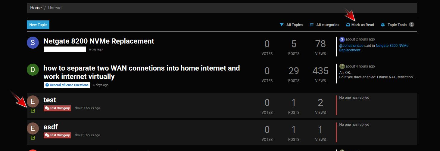
It’s the Netgate hardware forum that’s not visible but the empty spot is clickable.
-
@SteveITS yeah your font sizes look horrible as well - and see you can not see what category that netgate 8200 was in.. What idiot designer would pick white font on white background?? Someone that is color blind and just randomly picking squares for the color combo? ;) I would think even a color blind person could tell they can't see the text ;)
Unless your blind? And you have your font size huge on your mobile device? ;)
-
FWIW, I use the Dark Reader FF plugin, which does a decent job on most all-too-bright sites. Here's what it looks like when applied to the forum configured with the default forum theme
As you can see, it manages to differentiate between read/unread threads, yay!
Threads are also legible:
-
@pst thanks - will try it out.. Yeah that looks pretty good..
edit: Yeah that works pretty good, tied with a couple of changes with stylebot and can live with it ;) I can now tell the difference between unread, read and deleted topics.
-
Yup Dark Reader is as good as anything so far. Nice.

-
I am using dark reader, which was my initial thoughts as the culprit, the fonts looking too thick/bold now on the forum thread page, will try john's fixes.
-
@chrcoluk I set skin to default, using dark reader and then a couple of tweaks with stylebot
-
@SteveITS said in Forum change?:
It’s the Netgate hardware forum that’s not visible but the empty spot is clickable.
It's white on white in the Unread list:
<a href="/category/64/official-netgate-hardware" class="badge px-1 text-truncate text-decoration-none border" style="color: #FFFFFF;background-color: #ffffff;border-color: #ffffff!important; max-width: 70vw;">
<i class="fa fa-fw hidden"></i>
Official Netgate Hardware
</a>Only install packages for your version, or risk breaking it. Select your branch in System/Update/Update Settings.
When upgrading, allow 10-15 minutes to reboot, or more depending on packages, CPU, and/or disk speed.
Upvote 👍 helpful posts! -
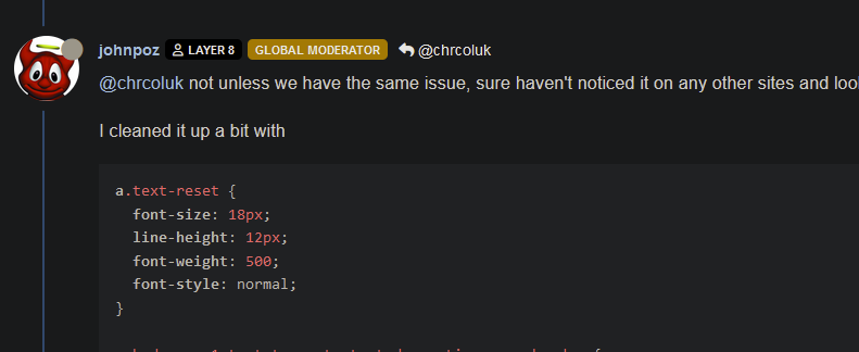
@SteveITS yeah I change the stupid white on white with this in stylebot
a.badge.px-1.text-truncate.text-decoration-none.border {
  border-style: none;
  font-weight: 400;
  font-style: normal;
  background-color: #181A1B;
  text-decoration: none;
  border-color: #181A1B;
}
Here are all the stylebot changes I have
li.category-item.hover-parent.py-2.mb-2.d-flex.flex-column.flex-lg-row.align-items-start {
  padding-bottom: 0px;
  padding-top: 1px;
  margin-bottom: 5px;
}

a.text-reset {
  font-weight: 500;
  font-style: normal;
  font-size: 18px;
  line-height: 20px;

}

a.badge.px-1.text-truncate.text-decoration-none.border {
  border-style: none;
  font-weight: 400;
  font-style: normal;
  background-color: #181A1B;
  text-decoration: none;
  border-color: #181A1B;
}
I could export the json from dark reader if you need/want it?
This is what mine currently looks like

-
Hi,
just a (maybe stupid) question: Is it not easier to contact the sysadmin of the forum and ask to change the underlying software in a way that makes it more readable/usable instead of using lot of self developed solutions? IMHO
Regards,
fireodo -
Yeah we are still looking at what we can do here. It looks like the theme we use doesn't play nicely with the skins in this version.
-
@stephenw10 One thing I have noticed on iOS Safari and just put together…if I reply to a message it looks fine. When I tap into the text field to type it zooms in enough to hide the > icon. Let’s see if this makes it:

…so I have to zoom out or scroll right to submit.
-
said in Forum change?:
white on white in the Unread list
Also "Off-Topic & Non-Support Discussion" I see.
BTW re: my iOS Safari comment, that might be an iOS thing? I think I've seen it on other web sites occasionally. It's oddly annoying but easily fixable by pinching or swiping left to "scroll" right.
-
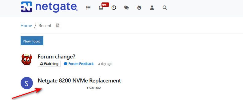
Looks like some update added previews of the images posted in the thread into the end of the subject line...
Not a fan of that, makes the forum look very cluttered. -
@mvikman yeah not a fan either.. And quick look doesn't seem to be a way to turn it off. Have to look into a way to just not load them..
An intelligent man is sometimes forced to be drunk to spend time with his fools
If you get confused: Listen to the Music Play
Please don't Chat/PM me for help, unless mod related
SG-4860 25.07.1 | Lab VMs 2.8.1, 25.07.1 -
@johnpoz
These filters in uBlock seem to work, don't know if it breaks something else though...forum.netgate.com##.d-xl-block.d-none.flex-shrink-0.text-decoration-none.position-relative.topic-thumbs forum.netgate.com##.hidden-empty.align-items-center.gap-2.flex-wrap.d-flexpfSense Plus 25.07.1-RELEASE (amd64)
Dell Optiplex 7040 SFF
Core i5-6500, 24GB RAM, 2x 240GB SSD (ZFS Mirror)
HPE 561T (X540-AT2), 2-port 10Gb RJ45
HPE 562SFP+ (X710-DA2), 2-port 10Gb SFP+