IPSEC Mobile GUI Improvement
-
Hi everyone,
As the bug reporting page asks us to post here rather than make suggestions there directly, was wondering if I could make a usability request:
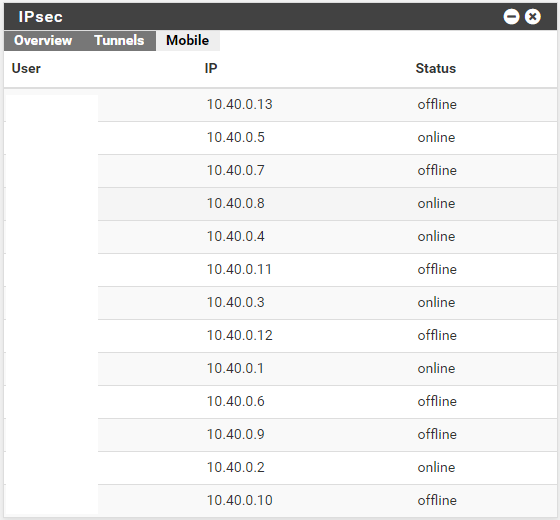
I have a number of (Cisco) IPSEC mobile clients connecting to the latest stable of pfSense and find it is difficult to quickly tell who is online and who is not (as one has to compare a column of "online" and "offline" entries).
I would suggest making the whole row (a dark-enough-to-read) green font when the client is connected and the whole row a red font when they are not. I think this would allow for a quick way to see who is connected (even better than replacing "online/offline" with colored icons) as it changes the client names as well for quick scanning.
It would also be really great if there was some way to configure the pfSense overview page to always show the mobile tab for IPSEC upon loading.
The same two requests would also apply to the upcoming wireguard UI.
Thank you for all your efforts on pfSense - it is a delight to use.
-
Current (Sanitized) Visual:
-
You can make a feature request for that on Redmine, just be sure to mention that you are talking about the IPsec Dashboard widget specifically.
If the same type of issue applies to Status > IPsec, then mention that as well.
-
Thanks jimp: done as suggested: Feature #10340 (https://redmine.pfsense.org/issues/10340)