Forum change?
-
FWIW, I use the Dark Reader FF plugin, which does a decent job on most all-too-bright sites. Here's what it looks like when applied to the forum configured with the default forum theme
As you can see, it manages to differentiate between read/unread threads, yay!
Threads are also legible:
-
@pst thanks - will try it out.. Yeah that looks pretty good..
edit: Yeah that works pretty good, tied with a couple of changes with stylebot and can live with it ;) I can now tell the difference between unread, read and deleted topics.
-
Yup Dark Reader is as good as anything so far. Nice.

-
I am using dark reader, which was my initial thoughts as the culprit, the fonts looking too thick/bold now on the forum thread page, will try john's fixes.
-
@chrcoluk I set skin to default, using dark reader and then a couple of tweaks with stylebot
-
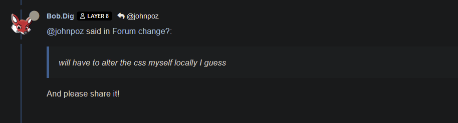
@SteveITS said in Forum change?:
It’s the Netgate hardware forum that’s not visible but the empty spot is clickable.
It's white on white in the Unread list:
<a href="/category/64/official-netgate-hardware" class="badge px-1 text-truncate text-decoration-none border" style="color: #FFFFFF;background-color: #ffffff;border-color: #ffffff!important; max-width: 70vw;">
<i class="fa fa-fw hidden"></i>
Official Netgate Hardware
</a>Only install packages for your version, or risk breaking it. Select your branch in System/Update/Update Settings.
When upgrading, allow 10-15 minutes to reboot, or more depending on packages, CPU, and/or disk speed.
Upvote 👍 helpful posts! -
@SteveITS yeah I change the stupid white on white with this in stylebot
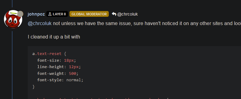
a.badge.px-1.text-truncate.text-decoration-none.border {
  border-style: none;
  font-weight: 400;
  font-style: normal;
  background-color: #181A1B;
  text-decoration: none;
  border-color: #181A1B;
}
Here are all the stylebot changes I have
li.category-item.hover-parent.py-2.mb-2.d-flex.flex-column.flex-lg-row.align-items-start {
  padding-bottom: 0px;
  padding-top: 1px;
  margin-bottom: 5px;
}

a.text-reset {
  font-weight: 500;
  font-style: normal;
  font-size: 18px;
  line-height: 20px;

}

a.badge.px-1.text-truncate.text-decoration-none.border {
  border-style: none;
  font-weight: 400;
  font-style: normal;
  background-color: #181A1B;
  text-decoration: none;
  border-color: #181A1B;
}
I could export the json from dark reader if you need/want it?
This is what mine currently looks like

-
Hi,
just a (maybe stupid) question: Is it not easier to contact the sysadmin of the forum and ask to change the underlying software in a way that makes it more readable/usable instead of using lot of self developed solutions? IMHO
Regards,
fireodo -
Yeah we are still looking at what we can do here. It looks like the theme we use doesn't play nicely with the skins in this version.
-
@stephenw10 One thing I have noticed on iOS Safari and just put together…if I reply to a message it looks fine. When I tap into the text field to type it zooms in enough to hide the > icon. Let’s see if this makes it:

…so I have to zoom out or scroll right to submit.
-
said in Forum change?:
white on white in the Unread list
Also "Off-Topic & Non-Support Discussion" I see.
BTW re: my iOS Safari comment, that might be an iOS thing? I think I've seen it on other web sites occasionally. It's oddly annoying but easily fixable by pinching or swiping left to "scroll" right.
-
Looks like some update added previews of the images posted in the thread into the end of the subject line...
Not a fan of that, makes the forum look very cluttered. -
@mvikman yeah not a fan either.. And quick look doesn't seem to be a way to turn it off. Have to look into a way to just not load them..
An intelligent man is sometimes forced to be drunk to spend time with his fools
If you get confused: Listen to the Music Play
Please don't Chat/PM me for help, unless mod related
SG-4860 25.07.1 | Lab VMs 2.8.1, 25.07.1 -
@johnpoz
These filters in uBlock seem to work, don't know if it breaks something else though...forum.netgate.com##.d-xl-block.d-none.flex-shrink-0.text-decoration-none.position-relative.topic-thumbs forum.netgate.com##.hidden-empty.align-items-center.gap-2.flex-wrap.d-flexpfSense Plus 25.07.1-RELEASE (amd64)
Dell Optiplex 7040 SFF
Core i5-6500, 24GB RAM, 2x 240GB SSD (ZFS Mirror)
HPE 561T (X540-AT2), 2-port 10Gb RJ45
HPE 562SFP+ (X710-DA2), 2-port 10Gb SFP+ -
@mvikman thanks will try them out in a bit
-
Yeah that took me a while to work out what I was seeing.
-
@johnpoz said in Forum change?:
yeah not a fan either.. And quick look doesn't seem to be a way to turn it off.
Also strongly not a fan...
-
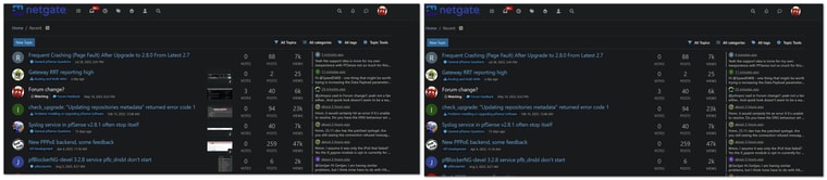
@mvikman yeah those work great from what looks like to me
before/after
If you add new features like that - it should be able to be turned off.. This isn't /funny in reddit where people just post memes and videos, etc..
-
Yup you would think there would be some obvious setting 'image previews' or similar but..... I'm finding nothing!
It looks like it's using the first available image as a topic thumbnail but there no setting for that

-
Looks like it's this but I'd still expect to be able to disable it completely:
https://community.nodebb.org/topic/18821/topic-thumbnails-uploads-and-media-display