rrd graphs different colors/shades
-
Currently replacing other routers with pfsense devices..
The traffic is the same but snmp graphs of the new interfaces are different shades..
The 6100 ix1 10G is replacing another devices 1G copper as a trunk.
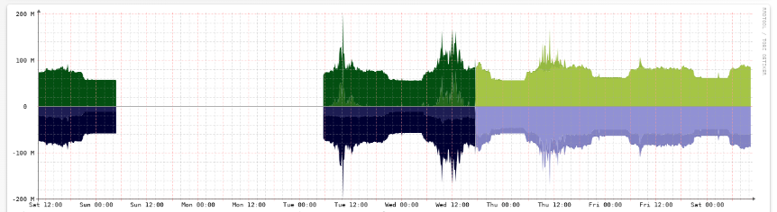
I cannot find the source, but I think the darker color indicates the time it took to retrieve the sample, or the difference in time from sample1 and sample2, which then is used for the darker shade plotted in sample3..
I'm taking it as the 6100 is handling the traffic AND reporting via snmp the counters easier/faster which is why the colors are lighter as they are 'the same time' from one sample to the next.. again 10G vs 1G trunk.. more pps, more caching, (linux Interrupt Coalescence (IC with ethtool) vs whatever is going on w/ freebsd.. is another learning curve for me atm..)
I feel this is a more general rrdtool question, but much of the rrd documentation is around creating graphs and not interpreting/analyzing..
Sample is from observium and obtained via snmp v2.
Thank you in advance.
-
Observium could be doing something like that but I think it's simply a different data source it's indicating.