RRD graphs
-
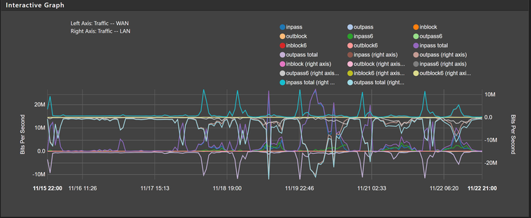
Is there any way to get the old RRD graphs back? The single graph on Monitoring page is completely useless (tries to cram too many things into a single graph, and instead of quickly seeing different timespans by simply scrolling down, I now have to reload the graph every time).
I know it's been a while since the 2.4 release, but I just can't get used to the Monitoring page.
-
No. There is no way to use the old style graphs.
-
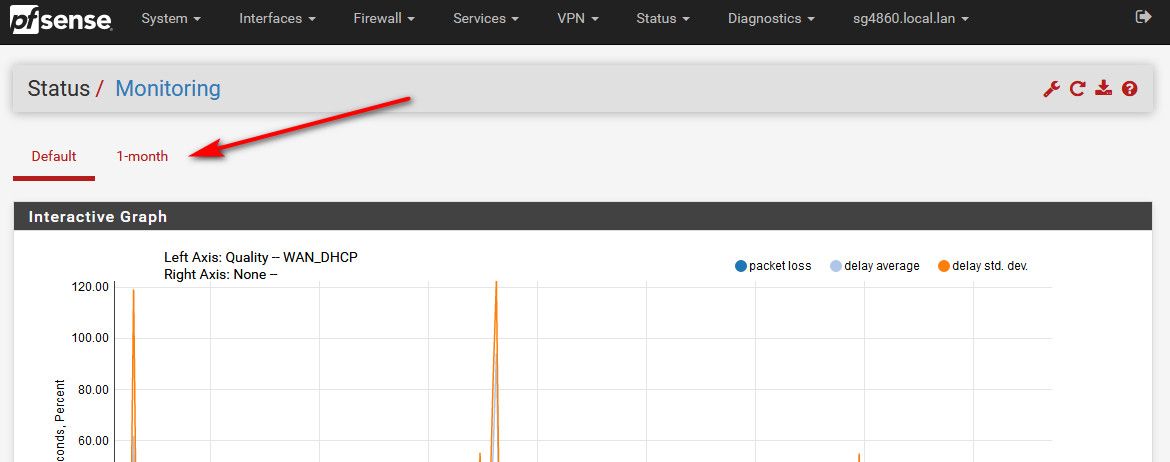
You understand you can create "views" right... So you can have multiple graphs based on different filtering in different views.
-
I've got views set up, but they're still slow, and only show a single timespan. It'd be slightly more useful if you could put multiple views on a page, at least that would make it easier to compare things, instead of the mess that happens when you have two views on a single graph:
-
Not talking about on the same graph..
You create a view, and then you just have a tab at the top that goes straight to that graph..
-
I know, I've got several, but they still take a few seconds to switch between.
-
A few seconds - omg... The horror ;)
What exactly are you looking for? What details do you need to see that makes life horrible if not instantly available?
-
If you're looking for more complete long term data you should consider exporting that to something else for analysis.
https://docs.netgate.com/pfsense/en/latest/monitoring/exporting-netflow-with-softflowd.htmlSteve
-
Or just query what your looking for via snmp, and graphing it.. Or something like netdata running on pfsense would give you lots of details. Or maybe telegraf or zabbix, etc.
What info are you looking for to be available in real time, or easy to view via say a dashboard or something? And then maybe we could discuss how best to accomplish that..
-
The old graphs worked just fine for me - while they were somewhat barren, they had the right information density and were fine to quickly figure out what was happening in the last day/week/month (and they didn't require me to set up and maintain yet another thing).
It would help a lot if the Monitoring page let me put multiple graphs on a single page (and maybe have a high contrast option, similarly to how VMWare ESXi's web UI has it - yes, the colours are ugly, but much easier to distinguish).