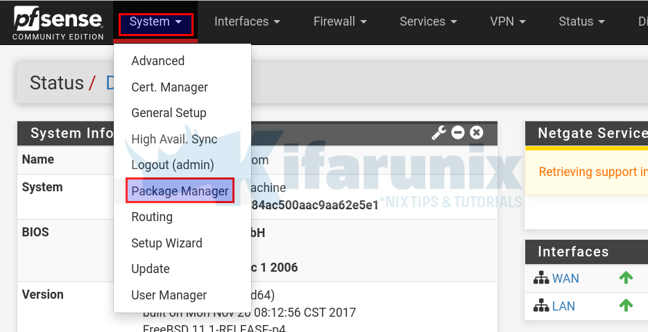
@sergei_shablovsky So whats the problem with the horizontal menu exactly? Many things use it. And yes it's got a bit crowded over the time.
I'd appreciate a bit of redesign or submenu'ism myself, as we run a prod setup with VERY large amounts of VLANs and the interface menu is longer then my monitor height - you have to scroll. That's not nice, yes. But besides that working better in a more left-side-style menu, where's the problem?
And why NAT are in Firewall, but Routing not in Firewall but in System? Because of coder logic on entry stage of creating product? ;)
Simply: logic! Alias, NAT, Rules and Schedules ALL relate to underlying paket filter "pf" and manipulate its ruleset. So it makes absolute sense, that everything firewall/filter related is in there. That's why pfBlockerNG is there after being installed, too, as it fetches IP lists and creates aliases. OK one might argue it also does DNS blocklists and that is more unbound related but hell - can't put it in both menus trees.
@sergei_shablovsky said in Grouping Items in menu vs A-Z list:
I know that You have a lot of docs made 10+ years ago, but is this really reason to make so khm... bad designed menu that **break all possible rules of creating visual interfaces?”.
nothing "bad menu design" about that IMHO.
@sergei_shablovsky said in Grouping Items in menu vs A-Z list:
Bu really so outdated, like web from early '80, or just after usenet/FIDO
Sure about that? The UI uses bootstrap - I've seen lots and lots of UIs/UXs that utilize bootstrap and use a horizontal layout. Nothing "old" about that if you can use it easily.
Why States and States Summary, NDP, ARP, SOCKETS and other are not in Status (that mean current state of Firewall) and sit in Diagnostics?
Because that are things you don't normally check all the time. States? State tables? ARP? You check that as a "status" all the time? I'm working with a multitude of customers and from my perspective the only time we have to take a look at state details, ARP or NDPs is - exactly - if we're doing debugging with the client to find out why something is not right or working as intended. So I'd say from our perspective those entries are exactly where I'd put them. Normal customer often has no clue what states really are and what they are needed for so to find that in "Status" they'd be more irritated then helped.
@sergei_shablovsky said in Grouping Items in menu vs A-Z list:
What is difference and why is Routes both in System and Diagnostics ? Is this different functionality ?
Of course - they are even called differently. So the argument is a bit void ;)
System/Routing(!) is about Gateways, GW Groups and manually adding static routes to those gateways. Diagnostics/Routes(!) is the system routing table. Nothing crazy about it.
@sergei_shablovsky said in Grouping Items in menu vs A-Z list:
And Logout just between the much used Package Manager and High Avail. Sync ? Really ?
THAT I agree on. As the function is already available via the icon in the upper right, I'd perhaps make it optionally show a text beside it (so people can see it easier) and remove the logout from the system menu.
Backup in Diagnostics are for diagnosing purpose or really working?
I agree, that would perhaps be better suited in "System" rather then Diagnostics and should perhaps read "Backup & Audit" as many forget, that there's a additional tab in Backup&Restore with the config audit and the ability to rollback configuration (although that would perhaps be better suited in Diagnostics as it's more of a tool you'd use in debugging sessions).
@sergei_shablovsky said in Grouping Items in menu vs A-Z list:
The groups in 2-nd level menu need to be visually divided:
I'm there on that one. I'd like to see the menus a bit cleaned up or divided into submenus - or even better the ability to switch to a left-hand/right-hand side menu. But the broad categorization is fine with our day to day usage or support tasks with debugging users.
As the comparison with OPNsense often pops up: The left-hand menu there is nice for things like huge VLAN deployments etc. as theres no endless top-to-bottom menu that way but them re-ordering every single freakin' item from Diagnostics to the "best matching" service or system function is incredibly tedious! Every time I'm out to debug one of those systems I'm forced to open up dozens of tabs as the navigation between the various diagnostic or logging menu items is simply nervewrecking. Switching from System General to Firewall logs to OpenVPN logs as you try to track down a connection problem? 3 clicks in the System/System Logs view. With their UI you're constantly navigating to 3-4 levels of submenus that aren't visible, but you have to click to open up. It's insane.
So compared to that pfSense is far more "debuggung-friendly" as all things you're looking for are in one place and not tossed around in various locations all hidden behind clicks and more clicks of submenus. And yeah, sure you can say "just do it via console then" but we are talking UI/UX only here :)
@sergei_shablovsky said in Grouping Items in menu vs A-Z list:
Apple Human Interface Guidelines
But seriously I've never seen webdevs or WebUX people being hold to desktop application standards. IMHO that comparison is a bit far fetched?
Not everything needs to be designed like an Apple or Desktop App, but I agree, a few points could profit from a bit of sorting and regrouping. And an option to switch to a side-style menu for those with loooooong list of Interfaces or installed services would surely agree that's more comfortable to navigate.
Cheers :)
\jens
