Forum themes?
-
@jegr I want the grid boxes back because it uses real estate better on the screen. These bubbles and wide spaces make it harder to find things. Most other forums are that way too.
-
@lburr That was answered in this forum and on the Netgate blog already, just read.
-
@jahonix Thanks, sorry I missed seeing that on the blog. All good now!
-
I liked the idea of the old forum toggling background colors of posts, something like
dark grey
darker grey
dark grey
darker grey
...The interchanging backgrounds really helped my old eyes, even though I'd prefer darker color schemes now.
-
Looking better :)
-
Forum is slowly shaping up :) but we're not done yet!
-
You should get rid of a lot of the ancient stickies. Some of them are years old and totally irrelevant today.
-
@kom said in Forum themes?:
You should get rid of a lot of the ancient stickies. Some of them are years old and totally irrelevant today.
That's on our TODO list. In fact we were discussing a few of them already this morning. Feel free to suggest any you think should be unpinned.
-
Mails from forum.netgate.com are coming in just fine now

-
@gertjan yup, should be good. Thanks for reporting these issues :)
-
Big
for the new ACME package sub-forum 
-
@gertjan said in Forum themes?:
Big
for the new ACME package sub-forum Yeah I figured it was time. Also considering one for FreeRADIUS and for Routing packages (FRR, Quagga) since they also seem to pile up in the main packages category
Remember: Upvote with the 👍 button for any user/post you find to be helpful, informative, or deserving of recognition!
Need help fast? Netgate Global Support!
Do not Chat/PM for help!
-
@kom said in Forum themes?:
You should get rid of a lot of the ancient stickies. Some of them are years old and totally irrelevant today.
These should be all cleaned up now, I removed quite a few. I tried to keep ones that were still accurate or relevant up. I didn't touch the IDS/IPS or pfBlocker categories though, I'll leave that up to the mods of those categories since I'm not sure what stickies are still relevant there.
-
@jimp said in Forum themes?:
Yeah I figured it was time. Also considering one for FreeRADIUS and for Routing packages (FRR, Quagga) since they also seem to pile up in the main packages category
-
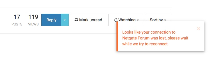
Anyone else seeing a lot of these:-
-
A few times, yes. But it got fewer the last days. After the initial switch to nodebb I saw them quite often.
BTW: another thing popped up a few seconds ago: "As a new user you only may post every 120s before you get 3 posts (or upvotes? - can't remember)" 120s aren't that bad, but I reply very quickly to many threads - and I don't consider myself an new user exactly :D
Edit: It's
Als neuer Benutzer kannst du nur einen Beitrag innerhalb von 120 Sekunden erstellen bis dein Ansehen 3 erreicht hat - Bitte warte bevor du erneut einen Beitrag erstellst. (in german)So it's 3 upvotes from posts before being able to post faster. That would be OK - but I suppose most users don't even know/see the upvote thingy (the little ^0) below a post god forbid even click it ;) Perhaps should be more clear what it does and how to use :)
Don't forget to upvote 👍 those who kindly offered their time and brainpower to help you!
If you're interested, I'm available to discuss details of German-speaking paid support (for companies) if needed.
-
@jegr said in Forum themes?:
ngy (the little ^0) be
Thanks !!!!!!!!!!!!!!!!!!
I could find for days now how up up vote ... and was a bit scared to ask for not passing as the most stupid one today.
I found it - up voted your post (as @jimp did 30 sec ago) - some else will vote and deliver you soon. -
@jegr Done
, can I get 3 as well? -
@lburr said in Forum themes?:
@jegr Done
, can I get 3 as well?The whole idea is that you should post 3 "quality posts" (or, like me 2k5 pure ramble)
But ok, during the forum introduction every reason is valid, so there you go - done. -
 my post wasn't meant as a collector for upvotes, merely to point out it's hard to find how to give someone - hmm I always consider it a thank you! - for his post and his time. Perhaps an additional text like "upvote/thanks" next to the "^" will do that :)